
Bootstrap - It's one of the widely used responsive frameworks for building small as well as large-scale websites. It's used by some of the big companies and is actively developed by a group of experienced software engineers. Bootstrap has a 12 column responsive grid that can be easily modified so that your website renders perfectly on desktops, laptops, tablets, and smartphones.
It uses LESS CSS so that you not only get highly optimized CSS code but can also generate dynamic CSS output depending on the screen dimensions. Through dynamic variables support for CSS, developers can create highly customized design code targeted for specific devices.
Bootstrap is not just limited to a simple responsive grid. It includes powerful on-page elements like modal boxes, forms, different types of input fields, navigation menus, breadcrumbs and much more. In short, you just need to instantiate and extend the appropriate element needed for your web page.

Foundation - This is yet another powerful responsive framework used by some of the big names like National Geographic. This framework also contains a flexible 12 column grid that can be modified at will. You can not only create nested grids but can also create mobile grids very easily through Foundation framework.
It includes dozens of ready-made page elements (e.g forms, modal boxes, sliders) that facilitate rapid prototyping. And once the prototype is passed, you can simply extend and modify it to run on a production server. In simple words, the prototype itself can be converted to the actual website code without any need to start from scratch.
It also includes tons of mobile-friendly features that let you easily define styles for different mobile devices. This makes the development process very easy for tablets and smartphones. Through its extensive CSS style library, you can easily hide and show select page elements on different mobile devices.

Gumby Framework - Its fluid, nestable grid layout can be easily transformed into a fully responsive layout that will render perfectly on different screen resolutions. The default 960 footprint of the grid lets developers start from the most common layout extending it to match with different devices. It also comes with a rich set of PSD templates and a powerful UI kit so that you can quickly deploy an awesome responsive website.
Quite similar to other responsive frameworks, Gumby also includes powerful rapid prototyping tools to test your design on different devices very quickly. The collection of prototype elements lets you create a wireframe in no time which can be easily transformed into production code for the live website.
It also provides four different prepacked modules that contain different grid layouts and other goodies so that you can get started immediately. These packages contain 12 columns, 16 columns, hybrid and a master grid with tons of other helper modules, CSS, and scripts. You simply have to unpack the module and have to place it in the right directory.
Amazium - It contains a 960 grid system with a default 12 column layout that can be easily extended or modified to suit your needs. It has an intuitive column offsetting feature that helps in easily adjusting the columns and white space within the grid so that you don't have to mess with complex code.
It has special classes to hide and show select page elements on different devices. This way you can develop device-specific sections within a page without any worry. These classes automatically hide or show the relevant sections of a web page so that visitors get the most optimized and user-friendly version developed specially for that particular device.
Amazium also has a separate class to make all your images on the website completely responsive. This is a boon for websites using graphics extensively in different sections on the web page. It's not just the images, but with Amazium, you can also make your videos responsive.

Less Framework - This is one of the popular responsive frameworks used by large number of websites. It uses a single grid system that can be easily modified to render perfectly in different screen dimensions. Less framework uses golden ratio typography to provide the best visual appearance and readability for the readers.
If you're accessing a website made with this framework through an old mobile device or through IE 6 to 8, you'll be presented with the default grid layout. For all other devices and screen resolutions, you can freely create advanced responsive designs to maximize conversions. Since it uses a single responsive grid for all design variants, you don't have to rewrite common elements for different screen sizes.
You must possess good working knowledge of HTML and CSS to harness the power of Less framework. You can obtain the customized framework package to minimize the initial development process.
Base - This flexible framework provides fast responsive designs for all modern browsers as well as for old browsers like IE7. The framework package contains the grid template in PSD format that helps developers implement the design very quickly.
It contains a complete collection of CSS classes for typography and web page elements. This makes the coding process very easy and lets you focus on creating the content rather than worrying about layout dimensions. It also has a robust fallback mechanism to gracefully handle the situation when a supported screen dimension is not found on the device.
This framework also uses LESS CSS so that you can easily generate highly optimized dynamic CSS output for smooth rendering of your web pages. It also includes a handy HTML5 template so that advanced users can easily extend it and can leverage the features offered by it. The base framework also offers extensive documentation for beginners and intermediate users so that they can easily learn the basics and available features.

Responsive Aeon Framework - This responsive framework uses lots of advanced HTML5 elements to build rich interactive designs with minimal coding. The default 12 column grid can be easily modified to create flexible layouts for different segment of visitors. Through its advanced media queries, the grid adjusts itself smoothly on different screen resolutions.
Due to the parallel loading of JavaScript code, the framework renders the design unobtrusively without putting any adverse effect on the load times. For on page elements and typography, it has several additional JavaScript and CSS files to quickly deploy wireframes. This helps you create working prototypes in a quick time.
The framework comes in two different forms. One is the basic module consisting of only core files and is ideal for seasoned web developers who can easily extend it into a more complex design. The second one contains additional files for beginners and intermediate users. These additional modules help in quickly deploying a working prototype on a development server.

Frameless - This framework is best suited for seasoned web developers who're comfortable in HTML and CSS. It gives you the minimal grid system layout to work upon. You can create infinite number of columns within its fixed grid. This essentially means that your design can literally render perfectly on an infinitely large viewport.
The framework lets you specify the exact dimensions where it should expand and adapt to the exact screen size. This way you can create custom versions for different grid sizes. It also contains a starter PSD grid template to start with. You can easily modify it to create a stunning website for your visitors.
Remember, this is not a fluid width framework. But, it provides you with an adaptive fixed width grid that can be adjusted for different screen resolutions dynamically. While developing a website through this framework, start with the smallest screen resolution and work upwards to a bigger screen.

Toast CSS Framework - This 12 column responsive grid can be easily modified through flexible box sizing system that keeps the rows, columns and boxes intact without breaking the grid. It lets you create your own custom media queries for targeting specific devices.
You can also exclude selective grid modules so that you only use that much code which is needed for the project. This helps in keeping the entire code small, manageable and optimized. It also includes a single column layout tailored specifically for mobile devices.
Apart from all modern browsers, it also provides support for IE8+ leaving IE7 and below unsupported which are already discouraged by several popular content management systems. Toast framework automatically clear floats saving you from the problem of adjusting the orientation of different sections within the grid.

YAML CSS Framework - If you have working knowledge of HTML and CSS, you can easily use this powerful and responsive CSS framework. You can use its standard 960 grid system to develop remarkable business websites in quick time. You can also create nested grids very easily to accommodate multiple elements within a web page section.
It inherently supports RTL languages that let you create multilingual websites very easily. It contains several building blocks for rapidly creating working prototypes. This speeds up the development process by leaps and bounds. The core framework module is very small in size that keeps the overall site code smaller facilitating fast load times.
It also has a unique and flexible grid system that lets you completely customize different content boxes within same dimensions. YAML also has a powerful responsive forms module that lets you collect visitors' data even on mobile devices. Through its rich typographical abilities, you can create pleasing and readable content sections to get more business from your website.
Kube CSS Framework - This framework is extremely easy-to-use and simply requires one base stylesheet import to get started. Its flexible grid offers over a dozen different alignment states to incorporate just about any design to meet your needs. Quite similar to other responsive frameworks, this one also supports nested grids.
It also has a rich on page elements library to quickly create forms, tables, fields and much more. Handling or embedding multimedia elements within this framework is also very easy. It also has a rich collection of buttons for use in your custom squeeze pages.
This framework comes in two different flavors. The first one is a minimal package containing the core modules, while the other one is the developer version containing add-on files and scripts. The latter package is more powerful and flexible that lets you develop beautiful responsive websites with minimal coding.

Responsivize - This unique framework is best suited for websites that receive good volume of mobile traffic. Since it is based on mobile first CSS methodology, you can easily concentrate on developing highly converting layouts for tablets and smartphones. This doesn't mean that it doesn't support regular desktop layout.
It also includes retina image support for creating beautiful grid layouts for high-resolution displays. The best way to develop a website through this framework is to first develop a mobile version, then a tablet version and then creating a desktop version. This eases the entire process as you can easily reuse several components across different resolutions.
It also uses several HTML5 elements to include advanced multimedia capabilities and for easy rendering of beautiful on page elements. It is a perfect foundation for building a robust and responsive solution for your business website.
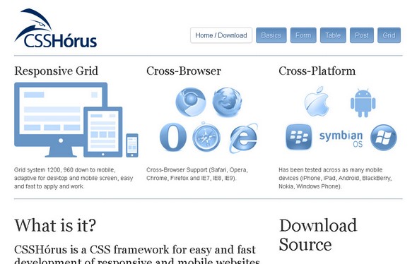
CSSHórus - This framework uses a 16 column responsive grid to power your website. It also has RTL support to create locale specific websites for select audiences. Through the power of LESS CSS, you get dynamic and optimized website code for faster and better browsing experience.
It has both 1200 and 960 grid system to create flexible layouts with ease. You can also use its grid inner padding feature for select sections on a web page. This framework has been thoroughly tested on different mobile platforms.
It also includes CSS classes for creating commonly used page elements like forms, tables, menus, breadcrumbs and much more. Websites built with this framework renders fine even in IE7. It also has special classes for creating posts quite similar to WordPress, which makes it ideal for websites publishing content on a regular basis.