
Pay Attention to the Design
One of the biggest mistakes publishers often make while installing a popup form is to simply include name and email fields within the form surrounded by one or two lines of text. This is the worst mistake you can do with your subscription form. I'll strongly suggest you invest in a premium popup subscription form plugin that can give you enough flexibility to design the form as per your requirements. The design of your popup form is one of the deciding factors that govern the success of your lead generation campaign.Let's see some of the important design considerations that must be taken care of to get an optimized popup form that brings business to you. All these design attributes are vital to the success of your popup form and must be implemented with care.
 Persuasive text - The primary text should be written with care stating the immediate benefit of subscription. It should include the summary of benefits a subscriber will get once he is on the list. You can create multiple copies of this text and can do extensive A/B or split testing to find out the best one that performs well with other elements on the popup form.
Relevant image - Often publishers do not care to add a relevant image to their popup subscription forms. It may take some space on the form, but a highly relevant image can boost your conversions overnight. Quite similar to the text copy, your image should also highlight the prime benefit a subscriber may get once he presses the button.
Bullet list - Whether you're using a static subscription form on a web page or the popup version, bullet points within the same immensely helps in persuading the potential subscriber. A bullet list can be used to explode the primary benefit into multiple parts to show what goodies are in store for the subscriber.
Call to action - No subscriber acquisition system is complete unless you've included a strong call to actions at the right places. A good call to action button or banner has the power to grow your email list at an exponential rate. You must experiment with multiple call-to-action buttons while working with your popup form.
Color Blending - Humans are very sensitive to colors and you must use them intelligently within your popup forms. A uniform color throughout the form is a big NO for an optimized version. You should blend both dark and light backgrounds in different sections to build a soothing and visually appealing popup subscription form.
Form closing option - And last but not the least is the close button on your subscription form. Sometimes, publishers design this button in such a way that it's almost invisible to the visitor. This only triggers frustration among the visitors and backfires on you.
Load Form at the Right Time
Loading time of the popup form is also one of the important attributes that can affect your conversions. If you're loading it too early or too late, you may not get the desired results. Almost all premium popup forms let you adjust the delay in load time for every popup form created by you. Following is a generic sample graph that shows conversions versus the delay in load times. First, you must take care to avoid loading your popup form almost instantly without any delay. This generally is very annoying for new visitors coming from organic sources. There are two broad approaches to introduce delay in load times for the subscription popup form. First, you may let the rendering of initial web page elements or you may let the user glance at the heading and starting paragraph of the content.
For both these approaches, the delay can range between 2 to 8 seconds. Loading your popup form beyond 10 seconds generally is not going to give you decent conversion rate. The ideal time delay ranges between 3 to 6 seconds. However, this is not a scientific parameter supported by concrete data set. It's just an indication of an optimal time range to get the maximum conversions. You must test it thoroughly on your blog to find the best time that works well for you.
Use Content-Aware Versions
Publishers often use advanced techniques to optimize their conversion funnels. This includes behavioral targeting as well as context-aware custom content serving. Almost every premium popup subscription plugin available for WordPress supports delivery of custom popup form based on the categories or posts.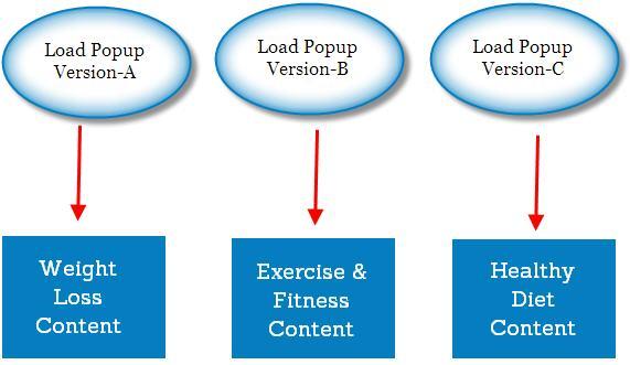 This essentially means that you can show different versions of subscription forms to the visitors landing on a specific type of content. This gives you an opportunity to create several versions targeting different segments of potential subscribers. Instead of creating a generic subscription form, you can create highly optimized forms targeted for individual content categories.
 While designing multiple forms, you must take care that the general look 'n' feel and layout of the forms is uniform, else a visitor switching from one content category to another may get annoyed or confused due to totally different popup subscription forms appearing on the same blog. For highly active categories, you can further divide the custom version into multiple sub-forms for testing purposes.
Load Popup Form at the Right Place
The placement of form also affects the conversion rate significantly. Some free solutions don't give you the liberty to customize the exact position of popup form on the web page. Some even go further and randomly place the web-form to different locations each time a new visitor is opening a post.Various studies have suggested that popup subscription forms placed right at the center of the viewport converts the best. I said viewport, not the web page because that's the active area that is seen by the visitor at any given time. The center-aligned form against all four corners should be relative to this viewport. All premium solutions let you configure that very easily.
Track Performance and Act Accordingly
No online marketing effort can be successful without the use web analytics software. Tracking and monitoring conversion funnels is an important part of the entire marketing process. The same thing applies to your popup subscription forms. You must track the performance of each version of the form you're creating for the potential subscribers.Simply tracking doesn't do the job. You must find out the trends or alarming signals from the accumulated data to come up with a better version. Some of the common metrics to watch are abandonment rate, bounce rate and delay in closing the form. These three metrics can give you a fair idea about the performance of any active popup form on your blog. You can use event tracking, custom variables, and link tagging to fetch all this data directly within your Google analytics account.
